Introduction.
Fonts are powerful tools for designers. They can set the tone, convey the message, and define the personality of your design. In this guide, you’ll learn how to choose and use them effectively to achieve design excellence.
You’ll discover how to:
- Pick the best typeface for your project, considering its purpose, audience, legibility, and compatibility.
- Use hierarchy, contrast, alignment, and white space to structure your content and capture attention.
- Apply these strategies to various layout projects, such as logos, websites, posters, and more.
The Typography Effect.
Typography is a critical element. It’s more than just selecting a type; it's about understanding how different fonts convey emotions, style, and identity. When it comes to making your designs pop, here's how it can help:
Typography is a key factor in creating the look and feel of your design. It can create harmony or contrast, balance or tension, order or chaos. It can also influence the mood and tone of your design, as different types can evoke different emotions and associations.
Here are some ways typography can affect your design:
- Convey brand identity: They can help you establish and reinforce your brand identity, as they can reflect your brand’s personality, values, and style. For example, a serif font can suggest tradition and authority, while a sans-serif font can suggest modernity and simplicity. A script font can suggest elegance and creativity, while a display font can suggest fun and uniqueness.
- Evoke emotions: They can also help you communicate the emotional aspect of your message, as they can trigger different feelings and reactions in the viewer. For example, a bold and heavy font can convey strength and confidence, while a light and thin font can convey delicacy and sophistication. A curved and rounded font can convey friendliness and warmth, while a sharp and angular font can convey aggressiveness and urgency.
- Enhance readability: They can also help you improve the readability and legibility of your content, as they can affect how easily and quickly the viewer can process the information. For example, a clear and simple style can make your content more readable, while a complex and decorative font can make your content more difficult to read. A large and spacious font can make your content more legible, while a small and tight font can make your content more illegible.
Choosing the Perfect Typeface.
The first step is to select a typeface that suits your project’s purpose and audience. There are various types, but they can be broadly categorized into two groups: serif and sans-serif. Serif fonts have decorative strokes at the ends of their letters, while sans-serif fonts don’t. Serif fonts are more traditional and elegant, while sans-serif fonts are more modern and simpler.
When choosing a typeface, consider these factors:
- Purpose: What are you trying to communicate, and who are you talking to? Different projects require different style. For example, a formal invitation might use a serif font, while a tech startup might use a sans-serif font.
- Legibility: How easy is it to read your text? Legibility is essential for effective communication. You need to choose a type that is clear and readable, especially for longer texts. For example, a script font might be stylish but hard to read.
- Compatibility: How well does your style match the overall aesthetic and your brand’s personality? Your text should complement the other design elements and create a cohesive look. For example, a playful font might clash with a serious design.
Tips and Tricks for Excellent Design with Fonts.
Once you’ve chosen a typeface, you can apply some strategies to make it stand out:
- Hierarchy: Hierarchy helps you structure your content and guide the viewer. You can create hierarchy by using different text, sizes, colours, and styles. For example, you can use a bold and large font for your main headline, a smaller and lighter font for your subheadings, and a different colour or style for your key points.
- Contrast: Contrast adds spice and excitement to your design. You can create contrast by using different style with distinct characteristics and personalities. For example, you can combine a serif and a sans-serif font to create a dynamic contrast.
- Alignment: You can align your text in different ways left, right, centre, or justify. The choice depends on your design’s requirements and the effect you want to achieve. For example, left alignment is comfortable and traditional, while centre alignment is elegant and symmetrical.
- White Space: White space, also known as negative space, is the space between and around elements in your design. It creates balance and breathing room in your design. It also directs the viewer’s attention to the most important elements in your design. You can use white space in different ways: line spacing, letter spacing, word spacing, paragraph spacing, and margins. For example, adequate white space around your text and other elements gives your design a clean and polished look.
Type of Fonts and Their Users.
There’s various type, each with its own style and purpose. Here are some of the most common and popular ones and how you can use them in your design:
- Serif Fonts: They have small strokes at the end of the letters, which give them a classic and sophisticated look. They are often used for print materials, such as books, magazines, and newspapers. They are also suitable for formal and professional designs, such as resumes, business cards, and certificates.
- Sans-Serif Fonts: They have no strokes at the end of the letters, which give them a sleek and modern look. They are often used for web design and digital content, such as websites, apps, and social media. They are also suitable for minimalist and casual designs, such as logos, flyers, and posters.
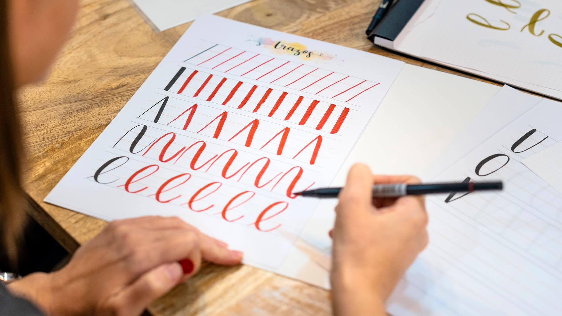
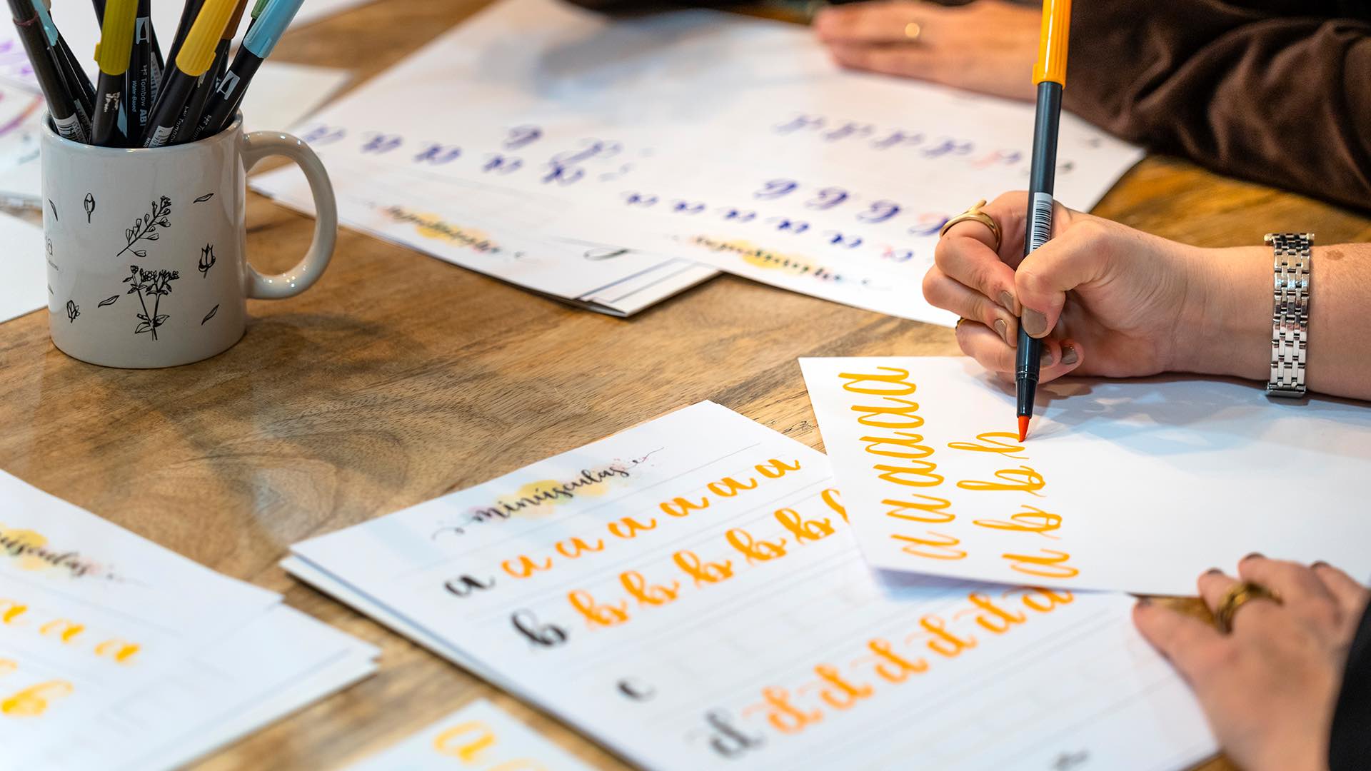
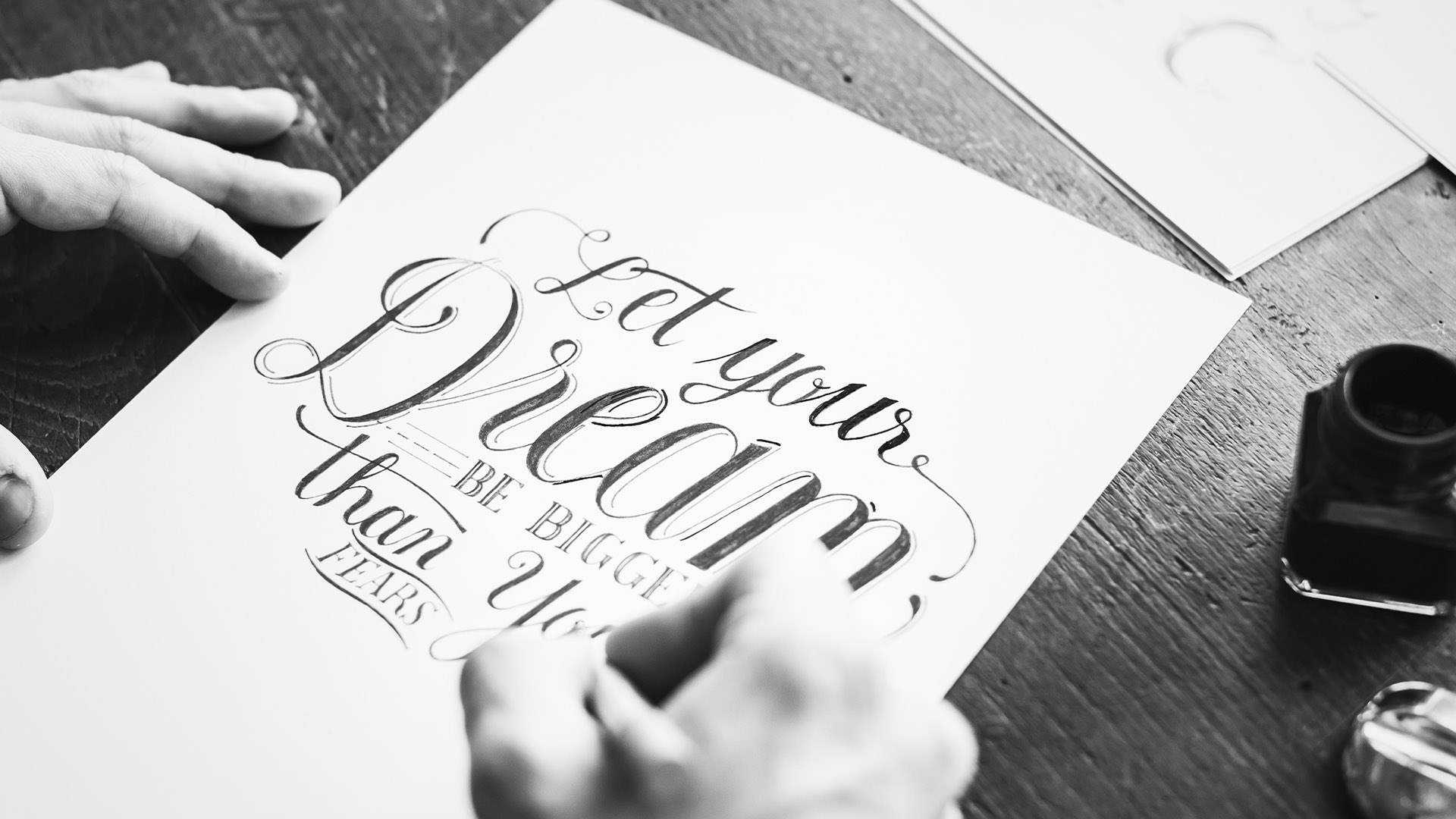
- Script Fonts: They mimic handwriting or calligraphy, which give them a personal and creative look. They are often used for branding, invitations, and artistic projects, such as logos, wedding cards, and illustrations. They are also suitable for elegant and romantic designs, such as labels, packaging, and quotes.
- Display Fonts: They are designed to capture attention and make a statement. They are often used for headlines, logos, and any part of your design that needs to stand out. They are also suitable for fun and quirky designs, such as banners, stickers, and t-shirts.
The Rule of Combinations.
While using a single font can make an impact, combining them can create a more interesting and appealing design. However, combining them is not as easy as it sounds. You need to consider some rules and principles to make sure your fonts work well together and don’t clash or confuse the viewer. Here are some tips on how to combine fonts:
- Choose writing styles that complement each other in style and mood: You want your fonts to create a harmonious and consistent look, not a chaotic and conflicting one. For example, if you’re creating a formal and professional design, you might want to use two serif fonts, or a serif and a sans-serif font. If you’re creating a fun and playful design, you might want to use two script fonts, or a script and a display font.
- Choose fonts that contrast each other in weight and size: You want your text style to create a clear and effective hierarchy, not a flat and boring one. For example, if you’re using a bold and large font for your headline, you might want to use a light and small font for your body text. If you’re using a thin and elegant font for your logo, you might want to use a thick and bold font for your tagline.
- Choose fonts that have similar or compatible characteristics: You want your text to create a balanced and unified look, not a disjointed and mismatched one. For example, if you’re using a font with round and curved letters, you might want to use another font with similar shapes. If you’re using a font with sharp and angular letters, you might want to use another font with compatible edges.
Conclusion.
Fonts are more than just a tool; they are the voice of your message and the key to your design excellence. By following these tips, you can choose and use them wisely and effectively, and create stunning designs that convey your message and personality.
Whether it’s a timeless serif, a modern sans-serif, a handwritten script, or a bold display font, your font selection can make the difference between a design that blends in and one that stands out.
So, the next time you start a design project, remember that fonts are not just letters; they are the expression of your content and the essence of your design.