Introduction.
In the world of design, colour isn't just a visual element, it's a powerful language that speaks to our emotions and perceptions. The hues you choose can either resonate with your audience or fall flat. Whether you're working on a logo, a website, a marketing campaign, or any creative project, selecting the right colours is an art and a science. In this blog, we’ll understand the art and science of choosing the right hues for your design. Delve deeper into our insights! Explore our blog at The Psychology of Color in Design: Harnessing Emotions through Palette Choice for a wealth of knowledge and inspiration.
Understanding the Psychology of Colour: The Emotional Palette.
Now, think of the colors you choose as tools to create feelings in people. For example, if you use a lot of red, it might make people feel passionate or excited. If you use mostly blue, it can create a sense of calm and trust. So, before you start your design, think about the emotions you want to evoke in the people who will see it and choose your colors accordingly. This way, you're using colors as a way to communicate and connect with your audience on a deeper level.
Red: The color of passion, love, and urgency. It grabs attention and ignites excitement.
Blue: Radiates trust, calm, and professionalism. It's the go-to choice for creating a reliable and secure atmosphere.
Green: Symbolizes nature, growth, and health. A color that resonates with eco-conscious and wellness brands.
Yellow: The hue of joy, optimism, and warmth. Perfect for infusing a sense of cheerfulness into your design.
Black: Exudes elegance, power, and sophistication. Often chosen by luxury and high-end brands.
Purple: Associated with royalty, creativity, and spirituality. It's a go-to for brands emphasizing innovation.These associations aren't random; they're rooted in psychology and cultural symbolism. When designing, understanding the psychology of color is your first crucial step.

Crafting Visual Harmony and Contrast with Colors.
In the design world, mixing colors is a bit like being a chef in the kitchen, combining various ingredients to create a delicious dish. When it comes to colors, you want to make sure they work well together and create a pleasant visual experience. Think of color harmony as creating a perfect blend, like the way ingredients in a recipe complement each other. This makes your design look balanced and pleasing to the eye.
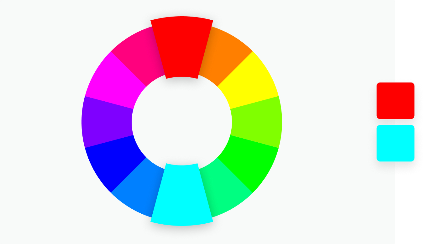
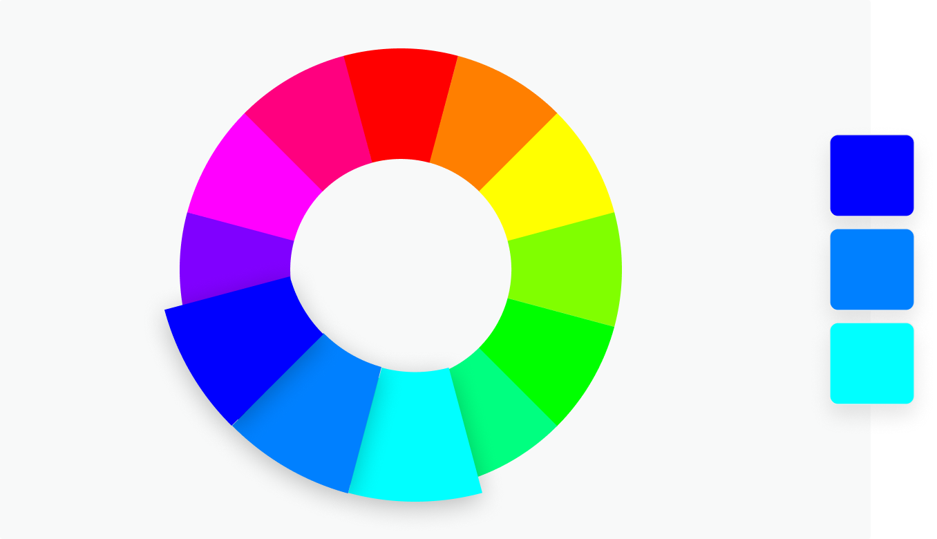
Complementary Colors: Complementary colors are a dynamic duo that reside on opposite ends of the color wheel. Think of them as color pairs like red and green or blue and orange. When you use these opposites together, they create a powerful and attention-grabbing effect, making your brand stand out in a sea of competition.
💡 Now let us picture it as choosing an outfit with colors that demand everyone's attention in a crowded room. These color combinations have the ability to make your brand's message bold and unforgettable . So, if your goal is to make a memorable statement and ensure your brand shines brightly, embracing the magic of complementary colors is the way to go!
Analogous Colors: Analogous colors are like next-door neighbors on the color wheel, peacefully sitting side by side. Picture a series of colors, such as blue, blue-green, and green, all snuggled together. When you use these neighborly colors in your design, they team up seamlessly, producing a feeling of toge each note smoothly flows into the next, creating a balanced sound. In design, these color combos don't just look good; they also provide a well-rounded palette.
💡 Think of a cozy living room with a soft blue sofa, seafoam green curtains, and pale beige walls. These analogous colors create a comfortable and harmonious atmosphere, much like the soothing tranquility of a beach vacation. So, in your design, choosing analogous colors, such as these, can make your project feel equally balanced and inviting.
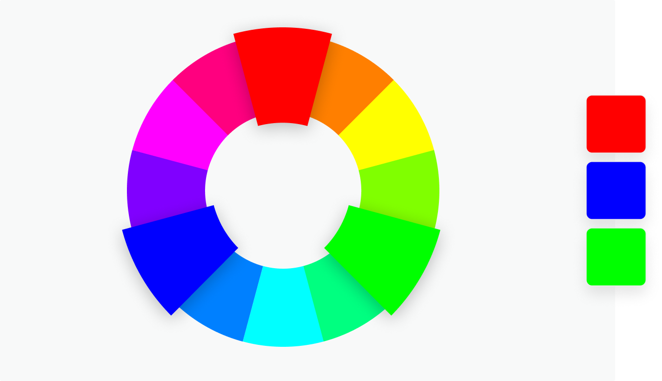
Triadic Colors: Triadic color schemes are all about balance and liveliness. Imagine a color wheel as a pie divided into equal thirds. Triadic colors are like three slices of this pie, evenly spaced apart. This clever combination of colors brings both harmony and excitement to your designs.
💡 Picture a playground with three exciting slides: one in red, another in blue, and the last in green. These colorful slides create a fun and balanced atmosphere, just like the triadic colors in design. In design, triadic colors are three equally spaced colors that work together to make your projects exciting and memorable, ideal for a vibrant and lively look.
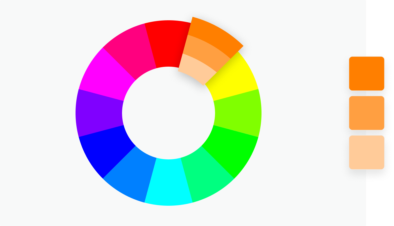
Monochromatic Colors: Monochromatic color schemes are like painting with various shades of a single color. Imagine a design where everything is different tones of a classy blue. It's like decorating a room with different shades of the same color, creating a sense of elegance and simplicity.
💡 Consider Tiffany & Co., famous for their signature blue jewelry boxes. They achieve a luxurious and minimalistic atmosphere by using varying shades of the color blue. This creates a sense of elegance and simplicity, making their brand and products feel high-end.
Design for Accessibility and User-Friendliness.
In the digital era, ensuring accessibility is paramount. The colors you choose should not only be visually appealing but also readable. For instance, combining light text with a light background or dark text with a dark background can hinder readability, especially for users with visual impairments. It's crucial to adhere to accessibility standards and create designs that remain usable for all.
Testing and Feedback: The Real-world Validation
The journey of color selection is not complete without real-world validation. Consider testing your color choices with your target audience or a focus group. Collect feedback to gauge their emotional responses and preferences. A/B testing can help determine which color variations resonate most with your audience. Real-world feedback is invaluable in refining your color palette.
Conclusion: The Fusion of Art and Science in Colour Selection.
Choosing the right hues for your design is an intricate blend of art and science. It's an endeavour that goes beyond aesthetics. It involves crafting an emotional journey, maintaining brand consistency, creating visual harmony and contrast, ensuring inclusivity, and validating through feedback.
When you master the art and science of colour in design, you wield a powerful tool. The colours you select can transcend the visual realm, forming a profound connection with your audience, conveying your brand's message, and etching your design into the memory of those who behold it. In the world of design, the right hues can paint a vivid and lasting picture, making your work truly memorable and resonating with your audience for years to come.