Introduction
Color is a powerful language in the world of design, capable of evoking emotions, shaping perceptions, and influencing behavior. In the realm of user interfaces, branding, and overall aesthetic appeal, understanding the psychology of color is a crucial aspect of creating impactful and resonant designs. We will delve into the fascinating interplay between color and human psychology, uncovering how designers can strategically harness emotions through thoughtful palette choices.
If you know more about how to choose colors for your design just read our blog on Choosing the Right Hues for Your Design
The Emotional Landscape of Colors.
Colors have a profound impact on our emotions, and designers wield this influence to create specific reactions and connections with users. Warm colors like reds and yellows often evoke feelings of energy, passion, and warmth, while cool tones like blues and greens tend to convey calmness, serenity, and trust. By strategically choosing a color palette, designers can guide users through a visual journey that complements the intended emotional experience.
The Science Behind Color Psychology.
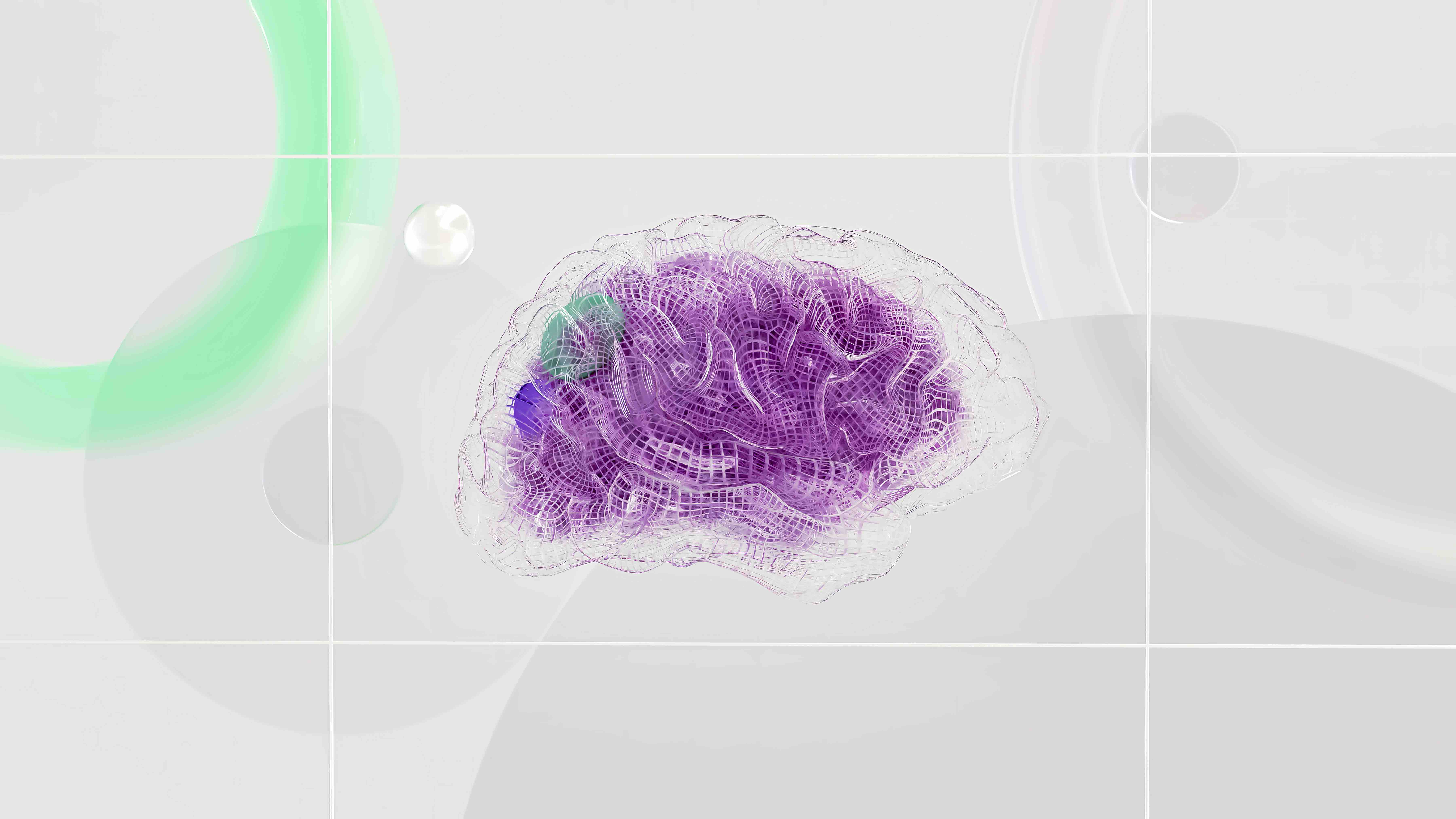
Colors have a profound and fascinating effect on our moods and emotions. This is primarily due to the way our brains perceive and interpret them. Different colors stimulate different parts of our brain, triggering unique emotional responses. For instance, blue, often associated with tranquility and calmness, is commonly used in spaces designed for relaxation or concentration. Conversely, red, a color that can incite a sense of urgency or alertness, is frequently seen in warning signs or calls to action.
Applying Color Psychology in Design.
In the realm of technology, color psychology can be leveraged to enhance user experience promote engagement, and guide user behavior. By strategically selecting colors designers can convey the intended message create a visual hierarchy and direct user attention. For instance, using contrasting colors for call-to-action buttons can draw the user's eye and encourage interaction. Similarly using calming colors in interfaces for meditation or relaxation applications can help create a serene and peaceful user experience. By understanding and applying color psychology, designers can create more effective and impactful design pieces that resonate with their target audience.
Cultural Context and Color Symbolism.
Color meanings can vary significantly across different cultures. In some cultures, white symbolizes purity and innocence, while in others, it may represent mourning. Understanding the cultural context and symbolism associated with colors is essential for global design considerations. Designers must navigate this intricate tapestry of meanings to ensure their color choices resonate positively with diverse audiences.
Creating Brand Identities with Color.
In the realm of branding, color plays a pivotal role in establishing and reinforcing brand identities. Companies often carefully select colors to evoke specific emotions and associations in their target audience. Consistent use of colors helps in brand recognition and fosters a connection between the brand and its audience. Think of the vibrant red of Coca-Cola or the calming blue of Facebook – these color choices are intentional and contribute significantly to the overall brand experience.
Color Harmony and Contrast.
In the hands of a skilled designer, color harmony and contrast can elevate a design to new heights. The careful selection of complementary colors creates a visually appealing and balanced composition, while the judicious use of contrast draws attention to key elements. Striking the right balance between harmony and contrast ensures that the design is both aesthetically pleasing and functional.
Designing for Accessibility.
In addition to evoking emotions color choices in design also play a crucial role in making interfaces accessible to individuals with color vision deficiencies. Considering the needs of all users is an essential aspect of inclusive design. Designers must ensure that color is not the sole means of conveying information and that there is sufficient contrast between text and background colors. This ensures that individuals with color vision deficiencies can navigate and interact with digital interfaces effectively.
The Impact of Color on User Behavior.
Beyond aesthetics, color choices can influence user behavior in various contexts. In web design, for example, a well-chosen call-to-action button color can encourage clicks and conversions. Similarly, retail environments leverage color psychology to create atmospheres that enhance the shopping experience. By understanding the psychological triggers associated with colors, designers can craft designs that guide users seamlessly through desired actions.
Looking Forward to 2024.
As we peer into the design landscape of 2024, the psychology of color continues to evolve. Emerging technologies, such as augmented reality and immersive experiences, provide new avenues for designers to experiment with color in unprecedented ways. The intersection of color psychology and user-centric design principles will be a defining feature of the visual experiences that captivate and engage audiences in the years to come.
Conclusion: Navigating the Colorful Palette of Design.
In the dynamic world of design, color is more than a visual element – it's a language that speaks to the emotions and preferences of users. As designers, embracing the psychology of color empowers us to create designs that resonate on a deeper level. Whether you're crafting a brand identity, designing a user interface, or curating a marketing campaign, the strategic use of color is a powerful tool in your arsenal.